deviant art

Deviant Login Shop  Join deviantART for FREE Take the Tour
[x]
Shop Similar Prints
This Print Not Available
Download Image
JPG, 1614×1360
more ▶

More from `Rahiden

Featured in Groups:

Details

September 1, 2011
388 KB
1614×1360
Link
Thumb

Statistics

Comments: 194
Favourites: 1,120 [who?]

Views: 18,203 (3 today)
Downloads: 256 (0 today)
[x]
:iconrahiden:
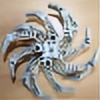
A swordfish I made, inspired after staring at Hahli Mahri's wingfin for too long. I personally think that this is my best work thus far :)
Other MOCs like this:

Bionicle (c) Lego
All designing, building and photography (c) Me
Add a Comment:
 

Daily Deviation

Given 2013-02-21
Bionicle MOC: Swordfish by `Rahiden ( Featured by ^SRudy )
:icon3rdeye88:
I suppose I'll start here with my Critiquefest

I was initially very blown away with this MOC. I knew Aiden had been working on it and kinda knew what to expect from him in terms of a Rahi MOC. He's done quite a few now. The swordfish may not necessarily exceeded expectations because I've been following him for a while now, but it definitely went in different directions than I anticipated. I remember when I first saw this that it inspired me to build another Rahi, but this time a sea creature. But was talked out of it. For this reason I give it an impact of Four(4) stars.

I'm giving it a five(5) stars for vision because Aiden said at the time "I personally think that this is my best work thus far" meaning that he was very satisfied with the outcome. And really, only the MOCer knows what it was truly supposed to be and whether it came out as envisioned or not.

Technique I give a four and a half(4 1/2) because while others mention gaps here and there, I understand that for this MOC to have any kind of function as a "fish" some space for movement has to be allowed. Also, with Aiden's "strictly bionicle" philosophy, it would be near impossible to achieve totally smooth surfaces and lines. The reason I took half a star off is because the Nokama Hordika mask at the front really throw off the vibe. Having a "face" that isn't the face on a head is confusing. I look to that as its "face" first, then my eye catches the actual eye. I feel that is one moderate blemish on an otherwise brilliantly executed MOC.

Originality gets a lower score because I feel that the concept and use of parts weren't so original. A swordfish while it hasn't previously been done by anyone else it is just that, a sword fish. Aiden didn't incorporate anything unique into it, making a bionicle universe version-a Rahi. Finally, the use of the parts seem a bit typical and almost "the obvious choice" in some places. I would have used a lot of the same parts for the same purposes. Though the Hali Mahri blade as the sail was a nice solution.

While not my favorite of his MOCs, or in my opinion his best work, The Swordfish is still another shining star in the MOC world, and another part of the bright constellation that is MapleMaster.
What do you think?
The Artist thought this was FAIR
27 out of 32 deviants thought this was fair.

:iconalex-darkrai:
You know, it's damn difficult to write a critique for a Maple Master MOC, because ... everything is so right about them.
Everything about this MOC is the way it should be. The color scheme, the spreading of the colors, the contours of the fins, achived by the use of different shape giving silver parts, the shape and look of the sword fishs 'sword'.
The only thing that doesn't look like I imagine the original fish is his back fin. I imagine it differently, but the ironic thing is, that it does look damn good nevertheless!
I would say, change the anatomy of the original fish and keep your MOC as it is, because it looks cooler than the original!

I gave 5 Stars on each originality, technique and impact, only the vision is a bit ... off. There are a few gaps in this otherwise completely compact model; the gaps between the fins and the gap behind the nukama head disturb the whole vision a bit.
But -again- it's ironic that this effect only occurs, because everything else looks so neat!
And the eyes ... they're good, they fit perfectly! ... but ... these small red dots on this otherwise so realistic MOC make him look so cute, somehow. That feeling just doesn't fit, but that's really just a subjective feeling, nothing more.

This MOC is just so complete, that it was really difficult to write about him. I really only could try to point out why this MOC is so great, the rest is just an attempt on analyzing the details.
I'm still astonished after writing this, because after carefully looking over the whole MOC, I was still not able to find any flaw, which would be worth correcting. This MOC should stay exactly as it is, it's just perfect!
What do you think?
The Artist thought this was FAIR
19 out of 21 deviants thought this was fair.

The Artist has requested Critique on this Artwork

Please sign up or login to post a critique.

:iconsharka121:
what does MOC stand for?
Reply
:iconrahiden:
`Rahiden 5 days ago  Hobbyist Traditional Artist
Reply
:iconmrnuubstar:
This thing looks like something that would swim around in the time of the dinosaurs!
Its beautifull, the fins look awsome, and the sword thingy looks cool 2.

Great moc 10/10
Reply
:iconrahiden:
`Rahiden Apr 14, 2013  Hobbyist Traditional Artist
Thanks very much! :D
Reply
:iconpsychscm:
That's great!
Reply
:icontyranous-king:
~Tyranous-King Feb 22, 2013  Hobbyist General Artist
Wow man ur really good
Reply
:iconhunter-94:
:noes: Holy crap! This is really well done!
Reply
:iconzunachina:
Mood: Fear ~Zunachina Feb 21, 2013  Student Artist
HOW i END UP HERE?
Reply
:iconmisterturtle:
how do you do this
Reply
Add a Comment: